When art director Tom Cardone talks about designing the style of a film, he could be talking about music. It’s all a matter of rhythm and counterpoint, contrast and dynamics. For Ferdinand, Blue Sky Studio’s adaptation of Munro Leaf’s 1936 children’s book about a Spanish bull who prefers flowers to fighting, Cardone and his team developed a stylised visual language inspired by the rolling landscapes of Southern Spain.
The goal was to make things “a little more fun than photorealism”, something achieved by sparing, but bold use of colour, comically stretching proportions, and repeating patterns the team discovered in authentic Spanish ceramics in the film’s paving slabs, wooden table tops and more.
We chatted briefly to Tom about his approach to the film’s style, its visual influences and where fans of the studio should look for Easter Eggs…
Robert Lawson’s illustrations in the book had a real combination of realism and whimsy, I’m thinking about the cork tree with the actual corks, which you didn’t include…
No, we didn’t.
What was the thinking behind it?
It wasn’t a conscious thing to not include that, obviously you see that the style of our film looks different than those illustrations. The book inspired this film very much, but the film had to be built out from there. For a feature film there are new characters and back story and things. We looked to the story to find the look of our film and it sort of emerged that way. It became a different representation, a retelling of the same thing.
But with that same combination of realism and whimsy?
Yeah, yeah. That was important to us too. We wanted the film to be fun, to have a lot of heart, and have a good message, and so we tried to bring that feeling of whimsy into things. We did that in just the way, for instance… the vehicles or even the architecture, we tried to push the style of it. That felt right for the way we wanted to tell this story.
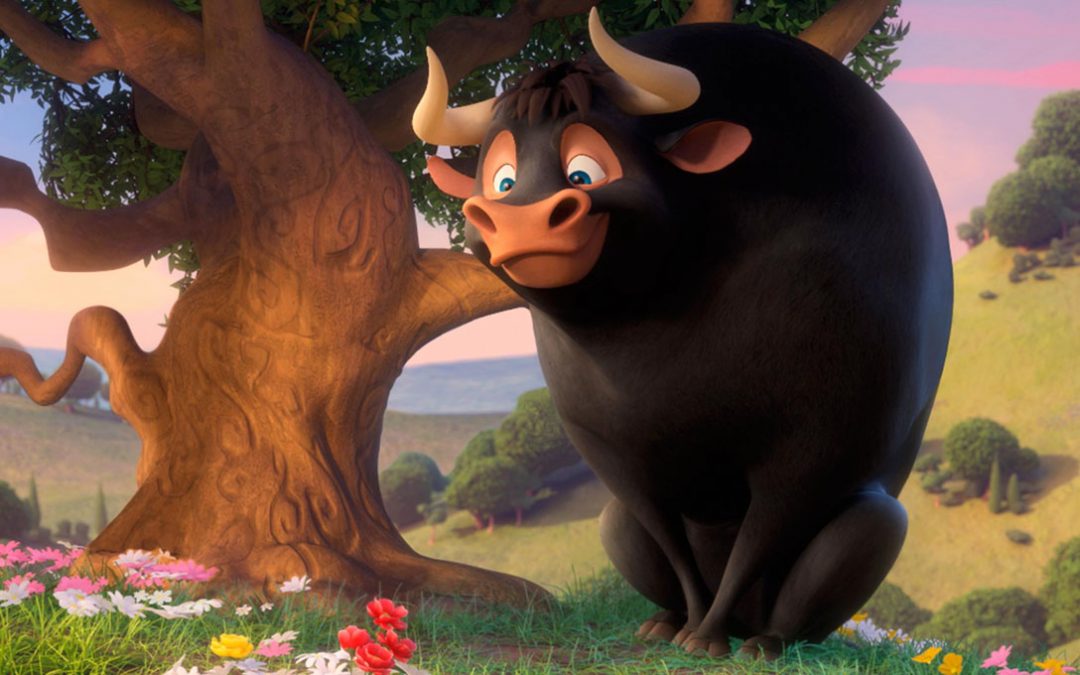
Tell me about the use of the colour red in the film, because it seemed it was quite sparingly used throughout, and then at the end, there’s this real flood of red from the flowers?
That’s great that you noticed that. We were very careful about how we planned the colour for the film. Red, in this film, it’s important and it gets your attention, so we had it in a couple of important places—the flower that Ferdinand… the main flower under the tree there. Most of the other flowers are yellow, pink and white, then we have a couple of red flowers there, which is the focal point when he sits under the tree—we really don’t use that intense red again until the cape at the end of the film. It’s just something that’s iconic and it catches your attention.
I loved what the film has to say about masculinity and different ways of being, and being more inclusive. Is the symbol of the blue butterfly used deliberately because that has a kind of gender significance? Was that deliberate?
No. The butterfly was more about picking a colour that would stand out in that landscape that would just compliment everything around it.
What importance did the Disney short have in terms of influencing the look?
None. We just really didn’t want… obviously we didn’t want to do anything that was done before.
They did win an Oscar though!
Yes, they did! And I love that short. We just, from the beginning, when we started this, we just really let the feeling and the look of it emerge from what we were doing and we went in a different direction that we felt was very suitable for the story.
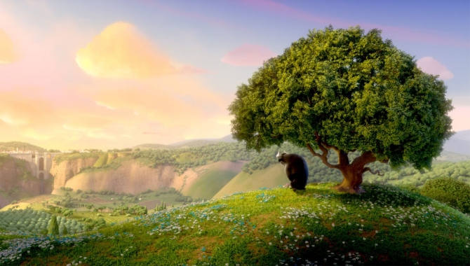
I remember going to the Blue Sky exhibition in Paris [May 2016, celebrating the studio’s 30th anniversary] with the beautiful, enormous paintings. I wonder, if you had to choose one or maybe two scenes from Ferdinand that would hang in that exhibition, what would you choose?
I think the view from his cork tree looking out over the rolling landscape to the village of Ronda where you see the bridge and the village. To me that image kind of captures what we tried to do with the style and the feeling of the movie.
How did you first come across the story? Did you read it as a child?
I did. You know, it’s funny, I just feel like I always knew that story and I think a lot of people feel that way about it, even if they don’t specifically remember having the book. When people ask me what I’m asking on and I say Ferdinand, they say ‘oh I love that story’. That’s the response that I get from a lot of people, and that’s how I feel about it too. I just feel like I always knew it, so I was excited about it because what you do remember from it is a very warm, touching story about this bull, and what I’m excited about is I feel like the heart of that stayed in our version of it.
When you were creating the visual language for the film, what specifically did you want to avoid in your depiction of Spain and the landscapes?
As far as avoiding anything in the depiction of Spain, we didn’t. Our goal was more to be authentic. We wanted it to be stylised, it’s not totally realistic, it’s a stylised film, but we wanted to base it in the reality of that place and make you feel you were watching something authentic, but also make it more fun by pushing the style of it.
Can I ask, for real Blue Sky nerds, are there any Easter Eggs or things hidden in the environment that we could be looking out for?
Yeah, yeah, there are. I can’t tell you what it is.
Point us in the right direction!
[Laughs] There’s one in the house, in Nina and Juan’s house, Ferdinand’s farm.
And that’s all you’re going to say?
[Laughs] Yes!
Okay, we’ll keep an eye out! Tom Cardone, thank you very much!
Ferdinand is out in cinemas this weekend.